// archive · older work
Zafyro
Mobile App UI
High-fidelity UI mockup for Zafyro — a mobile app concept. Focused on clean visual design, component consistency, and mobile-first interaction patterns. A visual showcase in systematic interface craft.
Approach: This was an exercise in visual discipline — building a coherent, polished mobile UI from a concept brief. Every screen was crafted around component reusability, typographic hierarchy, and touch-target usability. The result is a high-fidelity mockup that communicates product vision with precision.
Pay Only for the SIM You Actually Need
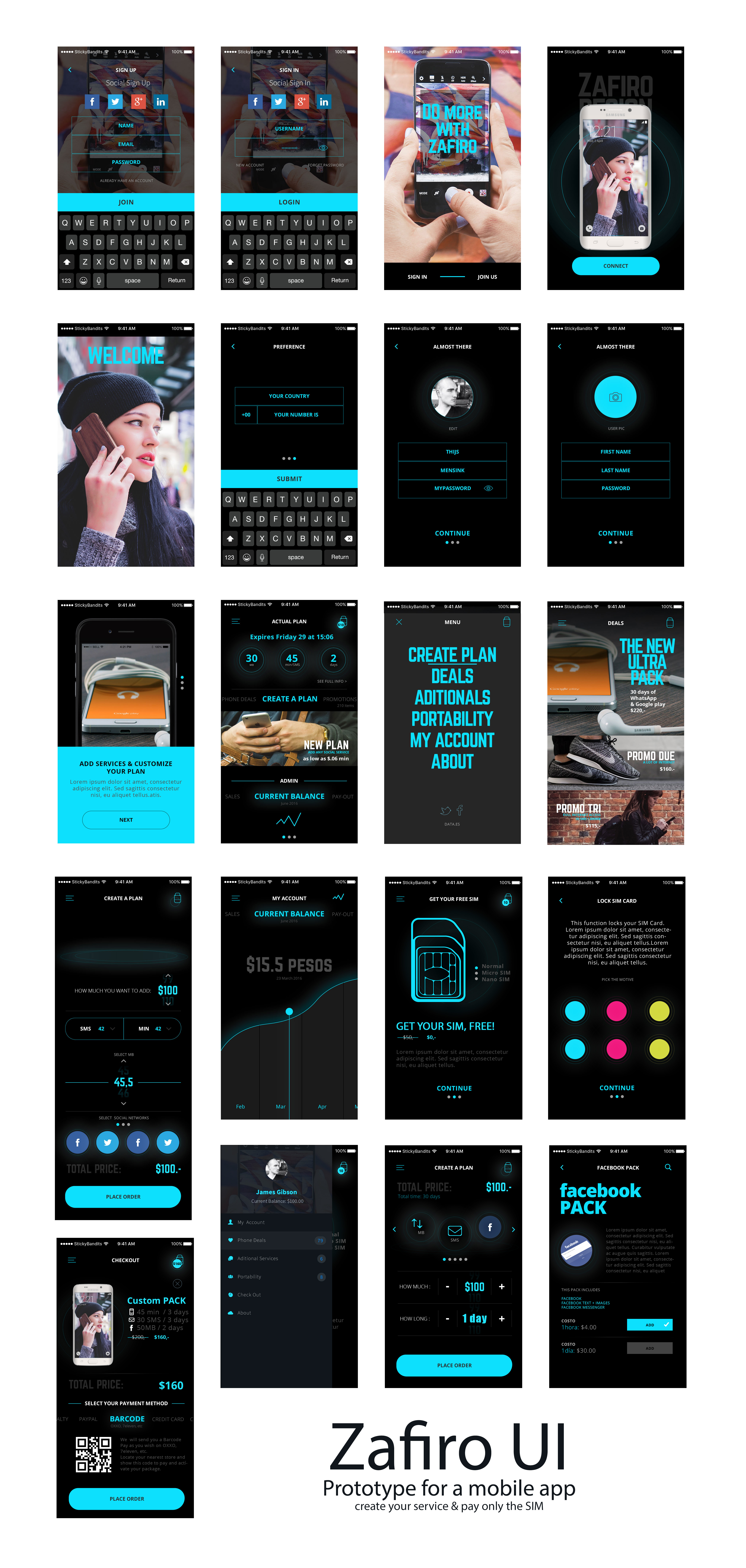
Zafyro was a service concept designed around a single insight: mobile plan pricing is opaque, bundled, and rarely matches actual usage. The product idea — "Create your plan, pay only for the SIM" — let users configure exactly what they needed before activating anything.
- Mobile-first concept: the entire configuration experience was designed for thumb-reach interaction
- Plan builder UI: users select data, voice, and SMS amounts independently
- Payment tied only to SIM activation — no commitment before the user was ready
- High-fidelity prototype demonstrated the full plan-creation-to-checkout journey
High-Fidelity Mobile Interface
The Zafyro UI demonstrates a mature mobile design language — clean, structured, and purposeful. Component systems were built first, with screens assembled from consistent building blocks to ensure scalability across the product.
On Visual Systems
Zafyro was a compact but instructive project — the constraint of a single coherent visual identity across multiple screens pushed for disciplined design decision-making. Color, spacing, and type all follow strict rules that make the interface feel inevitable rather than arbitrary.
This kind of high-fidelity visual work informs how I approach larger UX systems: the visual layer is not decoration, it is communication.