From Bid to Blacktop: One Field App for Three Different Jobs
Designing GradeLine, a mobile-first field platform for a national paving and sealcoating contractor — the sales bid, the dispatcher's desk, and the crew foreman's phone in the heat, all one product, built through a forked, versioned prototyping pipeline a founder could click through without touching code.
give a sales rep, a dispatcher, and a crew foreman one coherent mobile product, when each works in a completely different context, and the product itself was still being defined underneath us?
The client runs paving and sealcoating crews across multiple regions, and the process that got a bid signed, scheduled, and finished still lived across paper tickets, spreadsheets, and phone calls. This engagement started in discovery, which meant the product itself kept shifting week to week — screens that looked settled on Monday were wrong by Thursday because the underlying business logic hadn't been locked yet.
The founder and the client-side stakeholders needed to see and react to real, current thinking constantly, not once a sprint. A static deck couldn't keep up, and asking a non-technical founder to pull a branch and run a dev server wasn't realistic either.
Four screens from across the app — sign-in, dispatch, and the two live-AR surfaces the field crew actually leans on (lot measurement and before/after site verification).
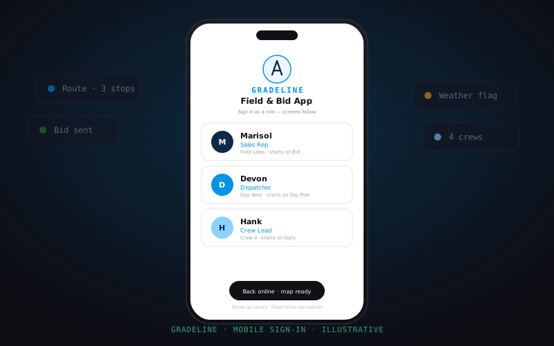
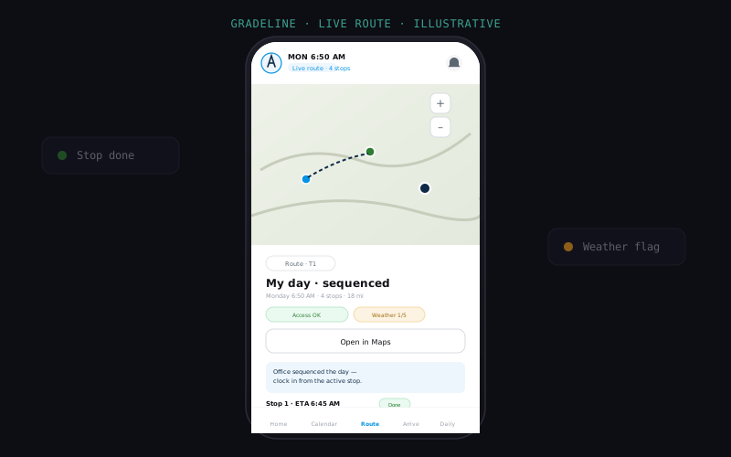
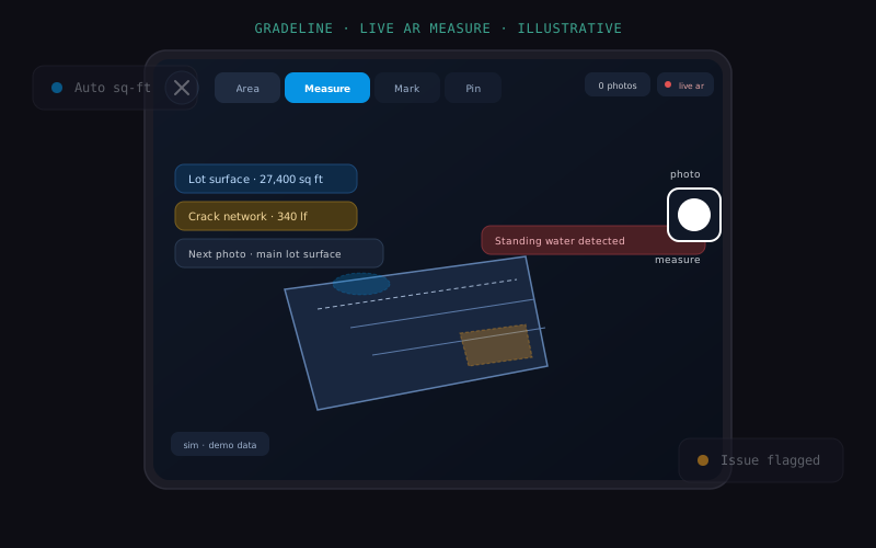
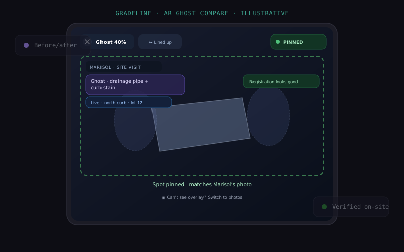
The production prototypes, Figma libraries, and stakeholder-facing screens are client-confidential and withheld. Everything above is rebuilt for this portfolio with a fictional product name, fictional personas, and generalized data — grounded in the real mobile layouts and the real design-system tokens, but with no client branding, real names, or real screens reproduced.
Instead of one prototype that got overwritten every time a decision changed, each meaningful direction became its own full fork of the same React/Tailwind codebase — a complete, independent build, not a feature flag. All forks deployed together as one static, multi-app site, so any version was a public link, not a local checkout.
Underneath every fork sat one living component catalog: the same button, input, badge, and list-row primitives, reused across every version and every persona's screens. That's what kept 8 diverging prototypes from turning into 8 different-looking products.
Process and Tools
The same five-stage arc repeated for every version fork, but the AI's role and the tools in hand shifted at each stage — from synthesizing on-site research to shipping a versioned, accessible prototype.
A Version Switcher a Founder Could Actually Use
Instead of a founder scrolling through Slack screenshots asking "which build is this," every fork got a plain-language label and a running note on what changed. A five-minute click-through replaced a half-hour status meeting. The same screen also had to work for three completely different people — try both controls below.
One Token Set, Three Platforms
The product design system runs on a white-first shadcn/ui + Tailwind foundation: navy carries every primary call to action at AA contrast, a scarce light blue is reserved for accents, focus, and map detail, and amber is demoted to a single job — the warning state — instead of doubling as a brand color. A shape-and-motion layer on top adapts sheets, radii, and dialog behavior per platform (iOS vs. Android) without touching the brand tokens underneath.
The differentiator was a live map with a custom detection layer showing parcels, routes, and flagged conditions — not a static screenshot, an actually interactive map component in the catalog that every persona's screens could reuse.
Making Cursor and Claude Cheaper to Run
A discovery-phase engagement means the AI-assisted workflow runs constantly, so I spent real time treating token spend as a design problem, not just an engineering one. The biggest lever wasn't the model's output, it was what got loaded into context in the first place — input tokens, not generation, are most of an agent loop's cost.
A few things that actually moved the number: defaulting to a reversible, soft exclusion for files that shouldn't be indexed by default but might still be needed (rather than a hard block that's unreachable even on purpose), preferring diff-based edits over full-file rewrites on anything long, and treating "context rot" as something that happens well before the window is actually full — so context gets loaded just-in-time and abstract-first instead of dumped upfront. Runaway agent loops got an external, mechanical limit — a checkpoint commit — instead of relying on the model to self-police. Prompt caching cut repeated-context cost dramatically, but only holds if the prefix stays stable, which is why the project's own working-memory file got reordered to put the fast-changing "current state" section last instead of first. And a full fork was reserved for anything that had to run live at the same time as everything else; a lighter branch handled exploration that was never going to ship.
What the Field Told Us, and Where It Broke
On-site research surfaced device-shaped gaps, not just screen-shaped ones. A dispatcher at a desk needed the reasoning behind a schedule, not just the result — "why this stop, why now" mattered as much as the assignment itself. A crew foreman's phone, in direct sun, on a schedule, got almost no patience for reading — copy had to be terse and voice-first by default. A sales screen was the one surface a client might actually read, so it was the one place the copy earned the right to be a full, persuasive sentence instead of a fragment. Seven separate on-site findings each traced forward into a specific interface decision this way, rather than sitting in a research deck nobody opened again.
Two honest weak points worth naming rather than hiding: a secondary visual theme prototyped in parallel didn't yet persist a reviewer's style choice across sessions, a known gap flagged for the next milestone rather than a shipped inconsistency. And the fork-per-version model that made stakeholder review painless started to cost real build time once the lineage passed half a dozen versions — every fork was a fully separate application, so the convenience had a compounding price.
None of this ran on one tool. Design reasoning and long-running project memory lived in one AI-agent runtime, implementation happened inside a second, and a separate component-generation workflow used by another teammate ran a third — coordinated through a shared, versioned memory file instead of ad hoc chat threads. On the human side: an engineering counterpart on the client's team, a second frontend developer, and the client's own product approver all worked off the same versioned prototypes and the same catalog, so nobody was ever reacting to a stale screenshot.
Every fork shipped as a real, clickable link, never a slide. That multiplied the deploy surface and the maintenance cost, but a discovery-phase founder acting on a five-minute click-through was worth more than a beautifully-produced deck nobody opened between meetings.
The hardest part was never any single screen. It was making three people's genuinely different jobs feel like one coherent product without pretending their jobs were the same job.