Rebuilding Benefits Software
Leading UX for a from-scratch rebuild of a legacy employee-benefits platform used by employers of every size and members of every generation, and building the AI-assisted workflow that let a small, distributed team design, validate and hand off two full portals in a matter of weeks, not quarters.
replace a decades-old benefits administration system, used by employers of every size and members of every generation, without slowing down a live pilot that stakeholders were already watching closely?
The existing platform had grown for years without a dedicated design function. The rules for enrollment, eligibility and rating lived scattered across documents and in the heads of a few long-tenured staff, not in the interface itself.
Roughly a third of the people who would use the new member experience are over 50, and the typical employer admin manages benefits as one responsibility among many, not as a specialist. None of that showed up anywhere in the old product, and it had to show up in the new one.
A Moving Target, Not a Clean Brief
None of this arrived as one settled brief. Requirements came in through several channels at once: written specs, recorded calls, live workshops. They didn't always agree with each other, either. A rule confirmed in one conversation would get quietly complicated by a document from a different team two weeks later, and it was on us to notice before it reached a screen.
The people pulling on the work wanted different things, too. One senior stakeholder believed AI could handle the design work end to end and treated a design system as overhead. Rather than argue the point, we built the evidence instead: several AI-generated screens for the exact same decision, sitting side by side, all inconsistent with each other. That single comparison did more than any argument would have. It reframed the design system as what makes AI-assisted work land in one consistent place, not a constraint on it.
Other decisions genuinely shifted mid-stream, for good reasons. The accessibility bar got raised on day one once the real user base was understood, an assumed medical-coverage scope narrowed to a firmer dental-and-vision pilot once the actual boundary was confirmed, and more than one piece of member-facing wording got proposed, used, and reversed in the same week once it collided with how that term is actually used in US healthcare. None of that was a planning failure. It's the normal shape of discovery when several people are feeding it at once.
What made it manageable wasn't trying to freeze requirements early. It was accepting that they'd keep moving, and building a habit around that: decide, write it down in one place everyone could check, and move on, instead of relitigating the same question across five different threads.
Small, Distributed, Mixed Human and AI
The design team was deliberately small and spread across three countries: a lead UX designer and a second product designer. They worked alongside two AI coding assistants that owned the actual front-end code, plus a separate AI research assistant dedicated to writing, terminology and quality checks.
On the client side, product and business leadership reviewed and signed off on every phase. Rather than one large team in one room, this was a small, mixed group with clearly split responsibilities, which is what let it move fast without losing consistency as more hands touched the same files.
Keeping that many contributors from stepping on each other took an explicit working agreement, not just good intentions. Anything going in front of the client got a tone-and-clarity pass first. Any new word we introduced for what a member would actually read got checked against the official US healthcare glossary before we used it. And any decision that touched a real benefits rule, like waiting periods or eligibility windows, got sanity-checked against how those things actually work in the industry before it ever reached engineering.
Code First, Then Figma
Instead of the usual Figma-first process, the team designed in code first. Real, working screens got built in the browser using the same design tokens as the live product, tested with real interaction, and only then captured into Figma automatically, screen by screen.
That order matters: Figma never drifted into an idealized version of the product that didn't match what actually shipped. It stayed a living library of exactly what was built, not a mockup that quietly falls out of date. Designers still worked natively in Figma to compose new screens, but always by reusing real components bound to the same variables running in the product, never by redrawing shapes from scratch.
That flow ran in both directions, deliberately gated. Real screens got captured into Figma automatically so the library always mirrored what actually shipped. Separately, once a component in the Figma library was reviewed and explicitly marked ready, an automated pipeline could generate real front-end code straight from it, wired to the same color, spacing and type variables used in the live product. Nothing got built from a screen that hadn't been signed off as ready. That single checkpoint was what let automation move fast without ever building on work still in flux.
Process and Tools, Stage by Stage
Two coding agents owned the front-end code, a dedicated AI research assistant owned writing and terminology, and every one of them worked inside the same gate: nothing shipped that hadn't been explicitly signed off by a human first.
| Stage | 01 · Frame | 02 · Explore | 03 · Build (code-first) | 04 · Validate | 05 · Ship |
|---|---|---|---|---|---|
| AI role | Drafts problem-framing options for stakeholder debate | Generates side-by-side option comparisons | Two coding agents own the actual front-end code | Research assistant checks terminology, tone, and copy against the US healthcare glossary | Generates production code from signed-off Figma components |
| Tools | AI research assistant | Claude, coding agents | Coding agents, shared design tokens | AI research assistant, Figma (auto-captured) | Automated Figma-to-code pipeline, shared token system |
| Process | Surfaced the how-might-we against a legacy platform, and a stakeholder betting AI could skip design entirely | Several AI-generated screens for the same decision, compared side by side, became the evidence for why a design system mattered | Real, working screens built in the browser first, tested with real interaction, before any Figma existed | Built screens synced automatically into Figma; wording and business rules sanity-checked before reaching engineering | Only components explicitly marked ready could trigger code generation: one gate, two portals shipped in weeks |
| Key question | What are we solving, and who still needs convincing? | What does each direction actually cost, and does it stay consistent? | What shape does this take once it's actually running? | Does this hold up against real accessibility and industry-rule constraints? | Is this ready to trace back to a signed-off decision? |
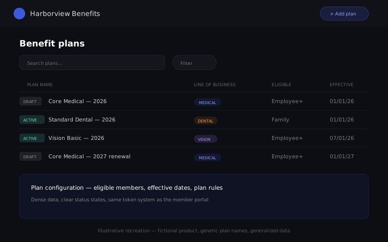
The production admin and member portals are client-confidential and withheld. Above is an interactive recreation built for this portfolio, using a fictional product name ("Harborview Benefits"), generic plan names, and generalized data — illustrating the same interaction pattern and design-token architecture described below, with no client branding, real names, or real screens reproduced.
One Connected Source, Not Scattered Documents
Separately from the design pipeline, the wider team set up a shared knowledge system that connected requirements, architecture decisions and test plans to each other, instead of letting them live as disconnected documents the way they had for years.
When a business analyst changed a rule, the system immediately showed which diagrams or user stories that change touched, before anyone edited them. Developers picked up implementation work straight from that same connected source, so a feature always traced back to the exact requirement that justified it. Product, design and engineering stopped quietly drifting out of sync with each other, which is the failure mode that usually kills momentum on a project this size.
How the Mess Actually Converged
Force-directed graph of how scattered inputs, shifting stakeholder asks and a legacy system with no design function fed into a working agreement and a shared knowledge system, which converged into one design token system, then radiated out to both portals, the Figma library, the generated front-end code, and the pilot that finally got demoed. Drag any node.
One Component, Two Portals, Zero Duplication
Every visual decision, color included, was built as a named token rather than a hardcoded value. That's what let the same button render one accent color in the employer-facing admin portal and a different accent in the member portal without maintaining two separate components.
/* 1. Primitive — the raw brand value (illustrative; not the real client value) */
--brand-primary: #3B5BDB;

/* 2. Semantic layer — theme-aware naming */
--primary: var(--brand-primary);

/* 3. Component bridge — what buttons, inputs and cards actually consume */
--ui-primary: var(--primary);
.btn-primary { background: var(--ui-primary); }

/* 4. Portal-scoped remap — same component, different accent, no duplication */
.member-portal {
  --ui-primary: var(--member-accent); /* #D97706, illustrative */
}
Four layers, one direction of truth: change the primitive once, and every button, badge and focus ring downstream updates with it, in code and in Figma alike.
Accessible by Default, Not by Afterthought
Accessibility was a day-one requirement, confirmed before a single wireframe existed, because of who actually uses this kind of software: a third of the member base is over 50, and most employer admins are generalists checking one thing between other tasks, not power users. The target was WCAG 2.2 Level AA across both portals.
None of that changes the visual language. It just means the design works just as well for the admin glancing at their phone between meetings as it does for someone reading every field carefully.
Proving It Helped, Not Just That It Looked Nicer
Before proposing a redesign, the more useful question was whether we could actually prove it helped. A full year of real usage data gave a solid baseline for how people use the product today, but it could only say how long people stayed, not whether they succeeded at what they came to do.
So alongside the redesign, we proposed a second, smaller set of numbers worth tracking going forward: task success rate per flow, error rate on forms, time to complete a plan configuration, a short satisfaction question after each task, an accessibility conformance score, and a simple self-service-versus-support-call ratio that speaks directly to cost. The goal was never a single "UX score." It was giving product and leadership an honest, specific way to see whether a change actually worked.
Eight Versions to the One Stakeholders Saw
Decide, write it down, move on. That habit is exactly what the version history looks like from the outside. The pilot went through eight numbered iterations before it was frozen as the version stakeholders actually reviewed. Early versions established the basic screen flow and content structure. Later ones absorbed direct stakeholder feedback line by line, tightened a full dual-theme system across both portals, and replaced every remaining placeholder interaction with a real one.
Version 1.8 was the one presented to the client, and it landed well. A parallel version branched off immediately afterward to carry the next phase of scope, while 1.8 itself stayed frozen as the honest record of what was actually demoed, not quietly rewritten after the fact.
The pipeline and the knowledge system took time away from screens in the first two weeks. We chose to spend it anyway, betting that a small team without that scaffolding would drown in inconsistency the moment more than two people touched the same files. It paid for itself by the third round of stakeholder feedback, when a single rewritten business rule updated three connected documents automatically instead of by hand.
The most counterintuitive lesson: the AI tools were most useful exactly where the work was most boring and easiest to get subtly wrong. Keeping a glossary consistent, keeping the design library in sync with code, tracing a changed requirement to every place it mattered, not the creative parts of the job. That's what freed the humans on the team to spend their time on the judgment calls that actually needed them.